🚀 Background
Skyscanner is a leading global travel search site that allows people to compare and book flights, hotels, and cars. However, the travel industry is constantly evolving, and user expectations are continuously changing. This brief outlines the scope of a UX research project aimed at assessing and improving the user experience on Skyscanner.com.
CoachesRianne van de Rijt - UX ResearcherCarolina Diana Rossi - UX Researcher & Behavioural Scientist
Timeline - 8 WeeksTools - Figma, Figjam, Useberry, Dovetail, ChatGPT, Photoshop
What We Offer
Increase Conversion Rates +
Identify friction points in the user journey that prevent users from completing bookings on Skyscanner’s web application.

👔 Stakeholder interviews
In order to understand the background, the business goals and align on clear objectives, interview questions were broken into 4 categories:
- Success metrics
- Experience and Insights
- Key Focus Areas
- Communication & Workflow
‘Trust and repeat usage, crucial to success’
John Mangelaars - CEO
‘Prioritizing a seamless and enjoyable booking process is key’
John Mangelaars - CEO
‘Insights into user perception compare to competitors are sought’
John Mangelaars - CEO
‘Understanding user emotional connection to guide future improvements’
Piero Sierra - CFO
‘Goal is to build customer loyalty and increase lifetime value’
Piero Sierra - CFO
‘Personalisation and simplification are key areas of improvement’
Andrew Philips - CTO
📋 Screening Survey
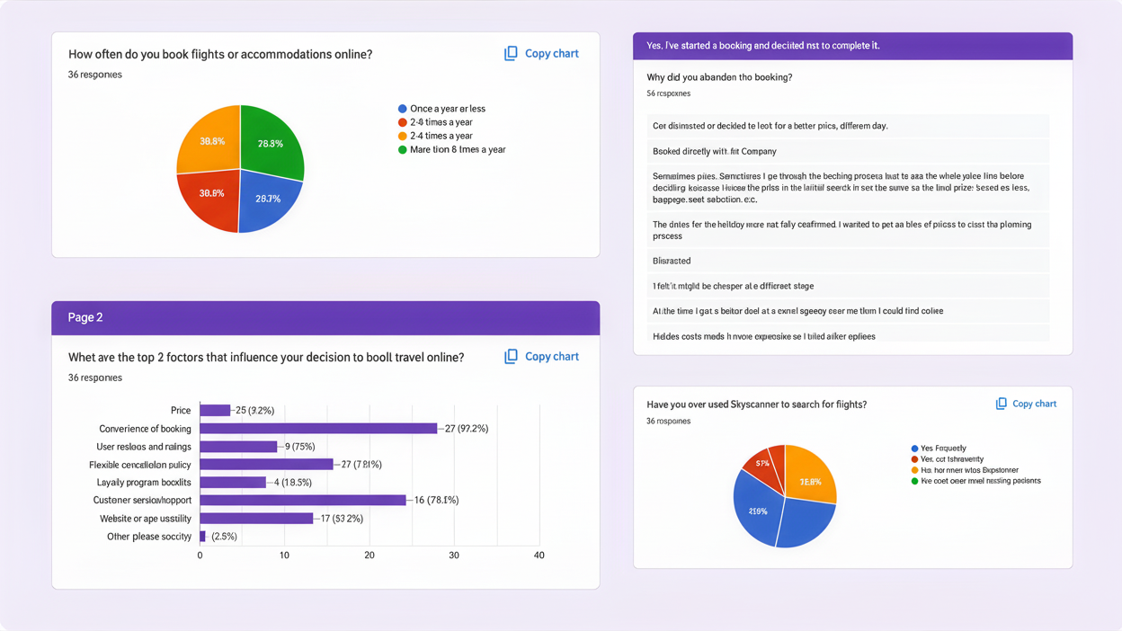
A screening survey was designed using Google Forms to identify participants aligned with the specific criteria of the business objective. The survey was shared across various platforms to gather diverse data, including demographic details, travel and booking habits, and technical proficiency.
🔍 Research Interviews / Usability Testing
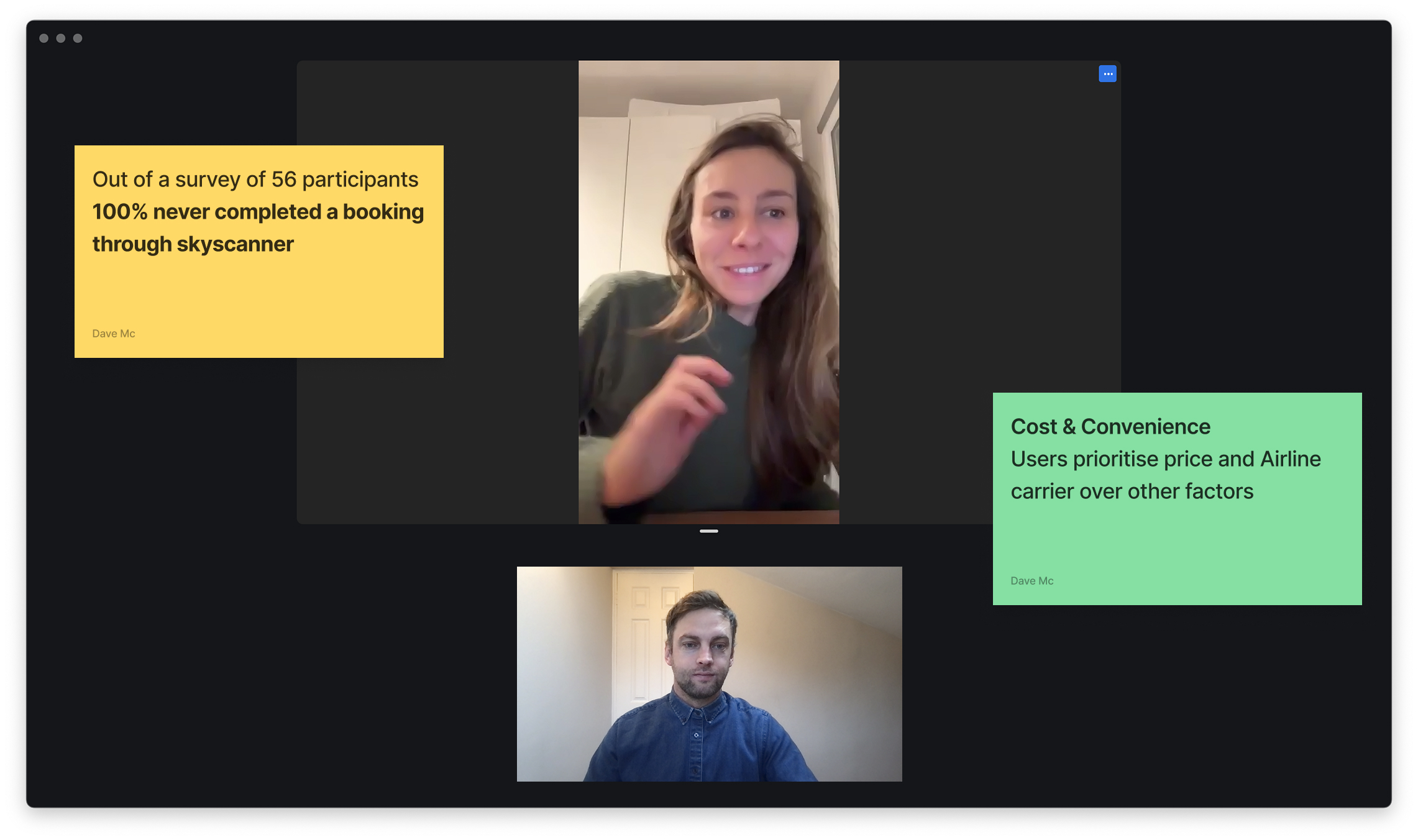
Five participants were selected and interviewed for moderated usability testing. These one-on-one sessions were conducted using Useberry to capture and explore in-depth behavioral insights, uncovering user needs, behaviors, concerns, and frustrations. The testing was structured into four key categories: Learnability, Memorability, Efficiency, Errors, and Satisfaction.
📍Analysis & Synthesis
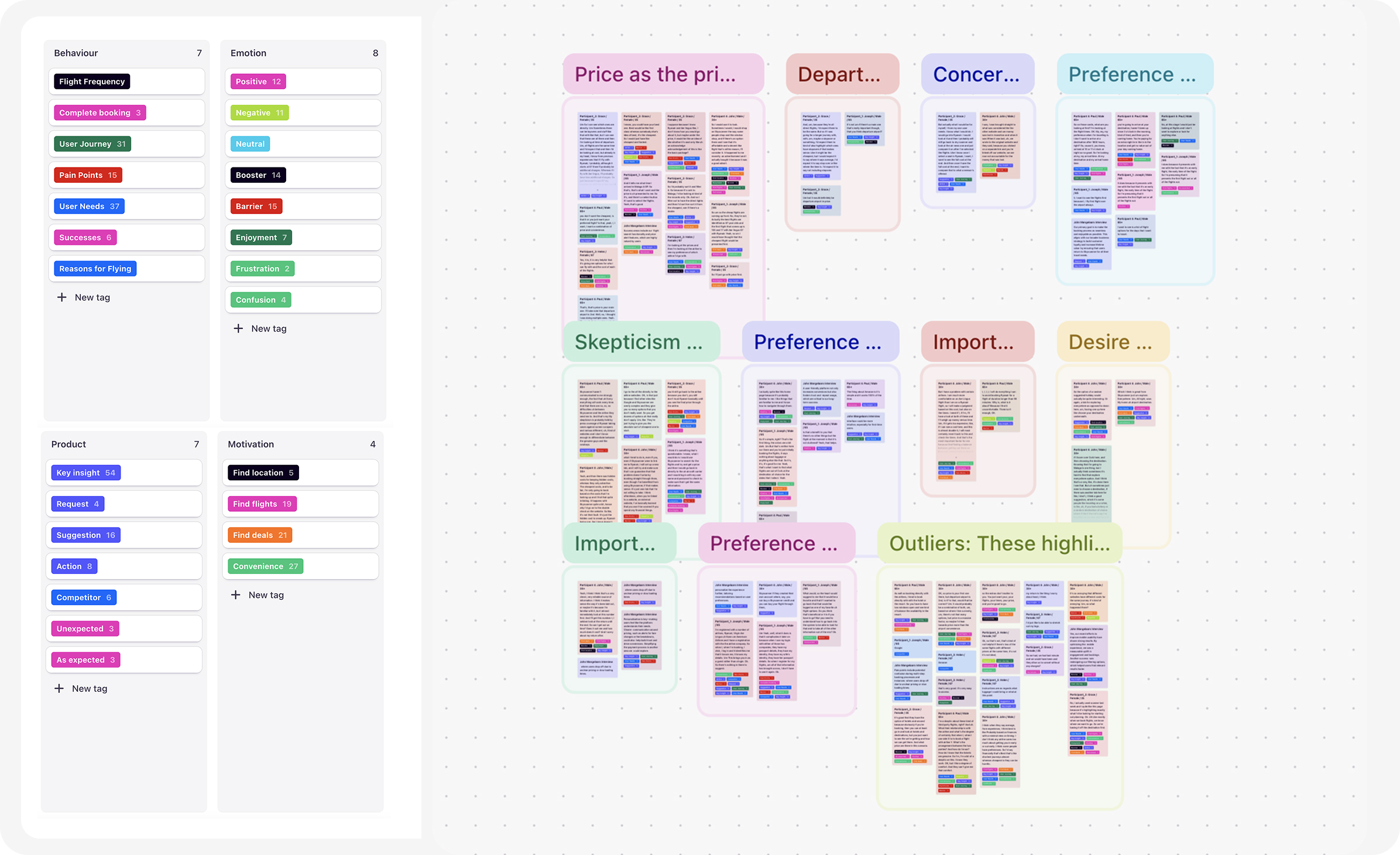
Dovetail's AI feature enabled me to build a research repository and establish a taxonomy to organize valuable insights from user experiences. Tags such as Behavior, Emotion, Product, Motivation, and Key Insights were utilized to analyze and audit the sessions effectively.
👨💼🧑💼 Personas
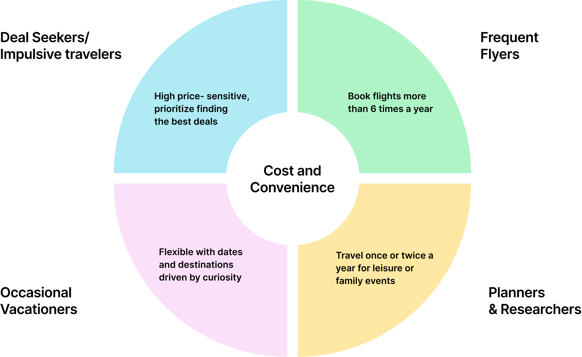
Clear patterns began to emerge across certain demographics. While these personas had distinct values, motivations, and pain points, a common primary goal unified them: cost and convenience. For instance, the price of a flight and the choice of departure airport were key deciding factors for all travellers.
📣 Feedback
After conducting affinity mapping of qualitative data, analyzing the research, and performing competitor benchmarking, the findings were synthesized to reveal several key UI user behaviors and pain points.
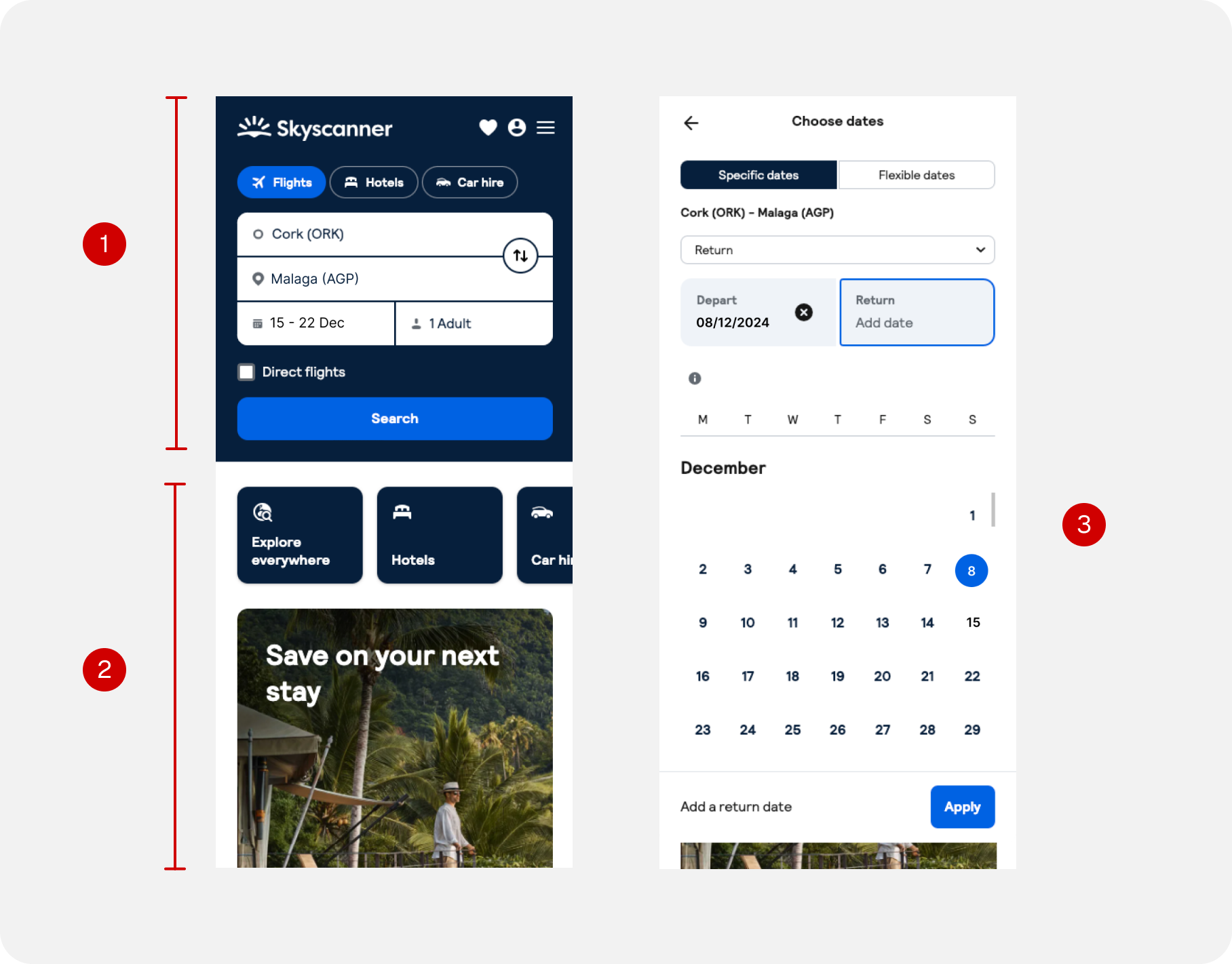
Search pages
01
Users enjoyed the simple and ‘uncluttered’ UI
02
Very rarely used. Users wanted information
on flights before they decided on hotels, car rentals
03
Users could get an early indication for pricing at this stage.
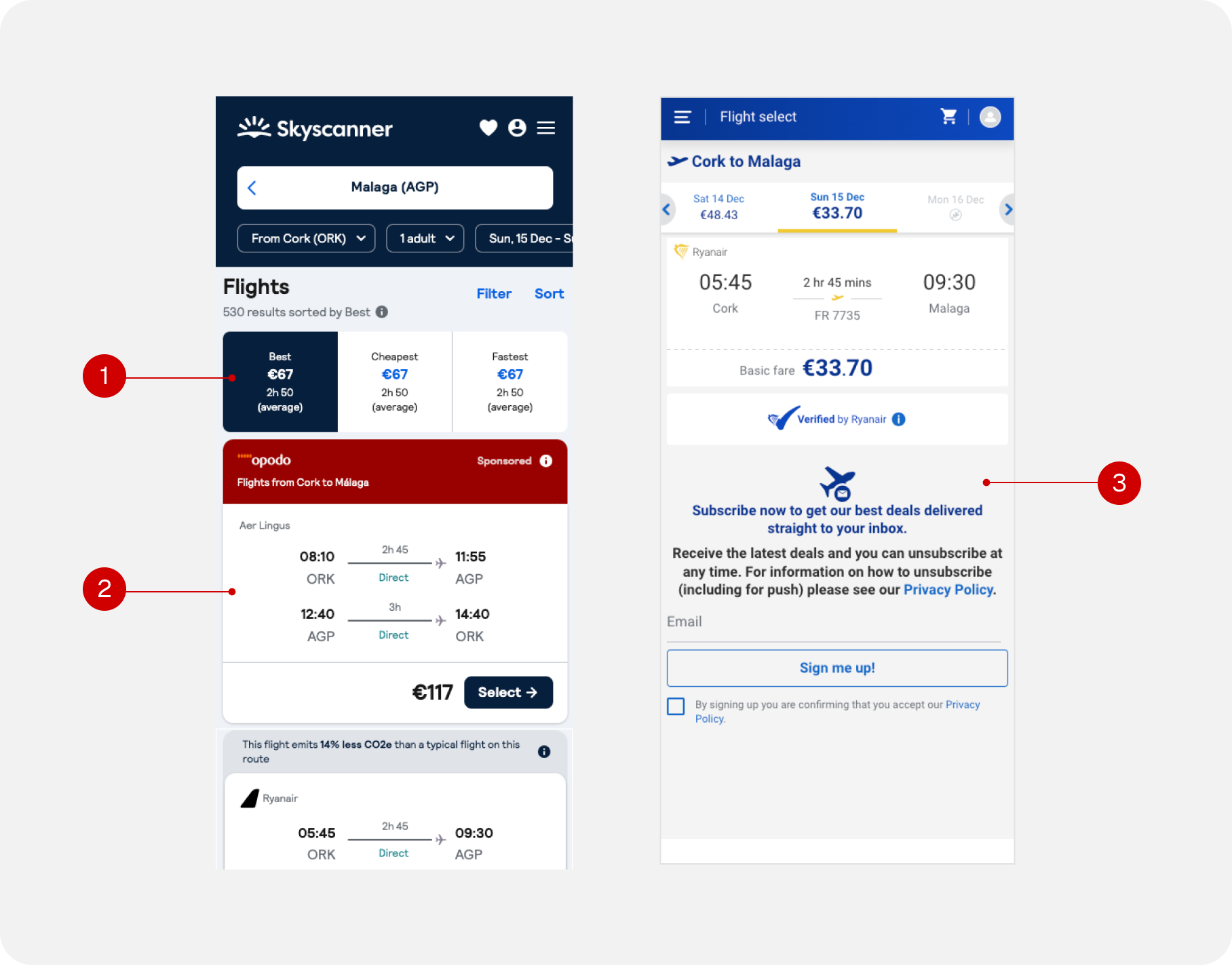
Results pages
01
‘Best’ too ambiguous a term to filter
02
More details needed in order for users to complete booking Luggage, seating, how busy the flight, points
03
Users never followed through on a booking from a skyscanner results page.
What I learned
Cost & ConvenienceUsers prioritised price and airline carrier above all other factors.
Flights FirstUsers preferred to see only flight options on the homepage, finding hotels and accommodations unnecessary until flight times and prices were determined.Trust vs No TrustIn a survey of 56 participants, none had ever completed a booking through Skyscanner. While users trusted the brand, they lacked confidence in the overall booking experience.
FrustrationsUsers became disengaged due to the inability to view detailed luggage options, flight capacity, seat selection, and hidden costs.
Lack of BenefitsWith passport information and frequent flyer points already stored on airline websites, users saw no added value in booking through Skyscanner.
Areas to Explore
Add Excitement to the JourneyTraveling is often associated with positive and thrilling experiences. The platform could evoke more charm and excitement to align with these emotions.
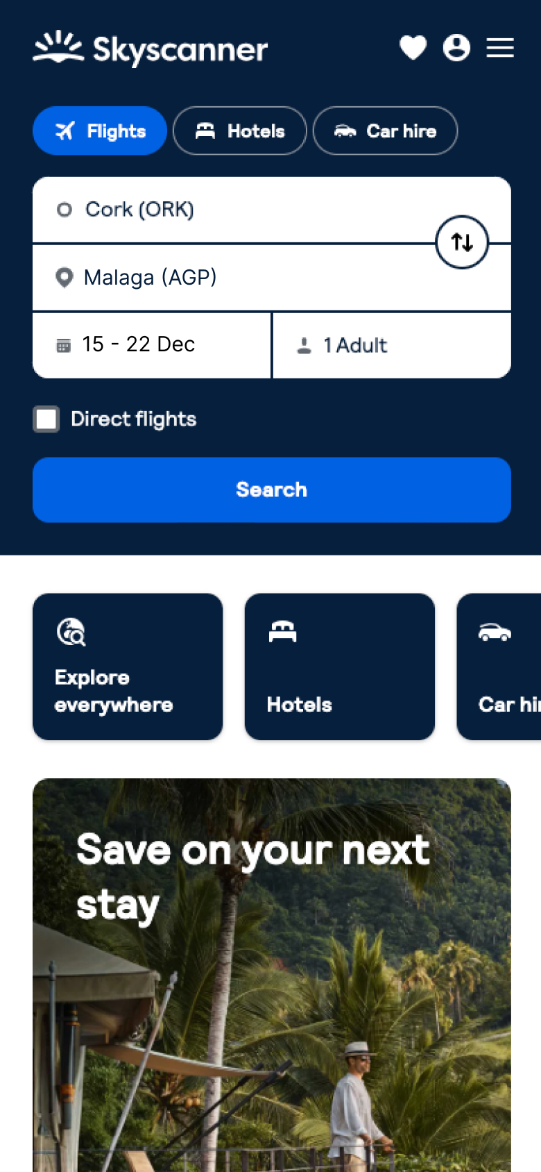
Master the Search, Not the SaleSkyscanner shines as a search tool and should focus on enhancing this strength rather than positioning itself as a booking platform.Simplify the HomepageThe homepage should prioritize search functionality, reducing the emphasis on cross-selling other services.
Optimize for Smart Device UsersGiven the nature of its service and how users interact with it, Skyscanner could better reflect the sleek, intuitive experience expected on modern smart devices.
Golfers
Camping

Snow

Cuisine

Best Trip Ever!
Calem, 50 - Ireland to Greenland$45 return flights



Explore
Choose destination
Homepage redesign
01
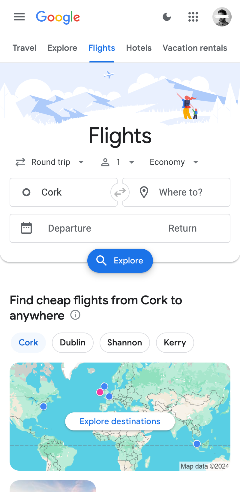
Enhance the visibility of the "Explore" option by showcasing personalized deals tailored to the user's selected departure airport.
02
Underneath the hero cta could focus more on different holiday destination depending on whats trending and in season
03
Add a map feature to search visually
04
Testimonials of amazing adventures booked through skyscanner.
Cork (ORK)
What destination?What dates?How many Adults?
Message


Future State
Skyscanner could introduce an innovative smart device feature. Amazon Alexa, Chat GPT meets Skyscanner. By enabling voice interaction, the platform could offer a unique, standout experience compared to its competitors.