🚀 Background
Over eight weeks, I collaborated with a global cohort of UX and Product Designers through a highly selective, industry-recognised design systems programme trusted by leading tech companies. Together, we explored how to design, scale, and govern robust systems—grounded in real-world workflows and cross-functional collaboration.
Guided by experienced mentors, we focused on system architecture, design tokens, semantic structuring, and scalable component thinking—balancing flexibility with consistency across evolving product needs.
CoachesOri Nevares - Design Mentor / FacilitatorMarvin Messenzehl - Design Mentor / Facilitator
Timeline - 8 WeeksTools - Figma, Figjam, ChatGPT, Photoshop
Goal
To establish a well-governed yet flexible approach for creating and evolving a design system, enabling cross-functional teams and stakeholders to contribute through a streamlined, adaptable process.
🎨 Primitives
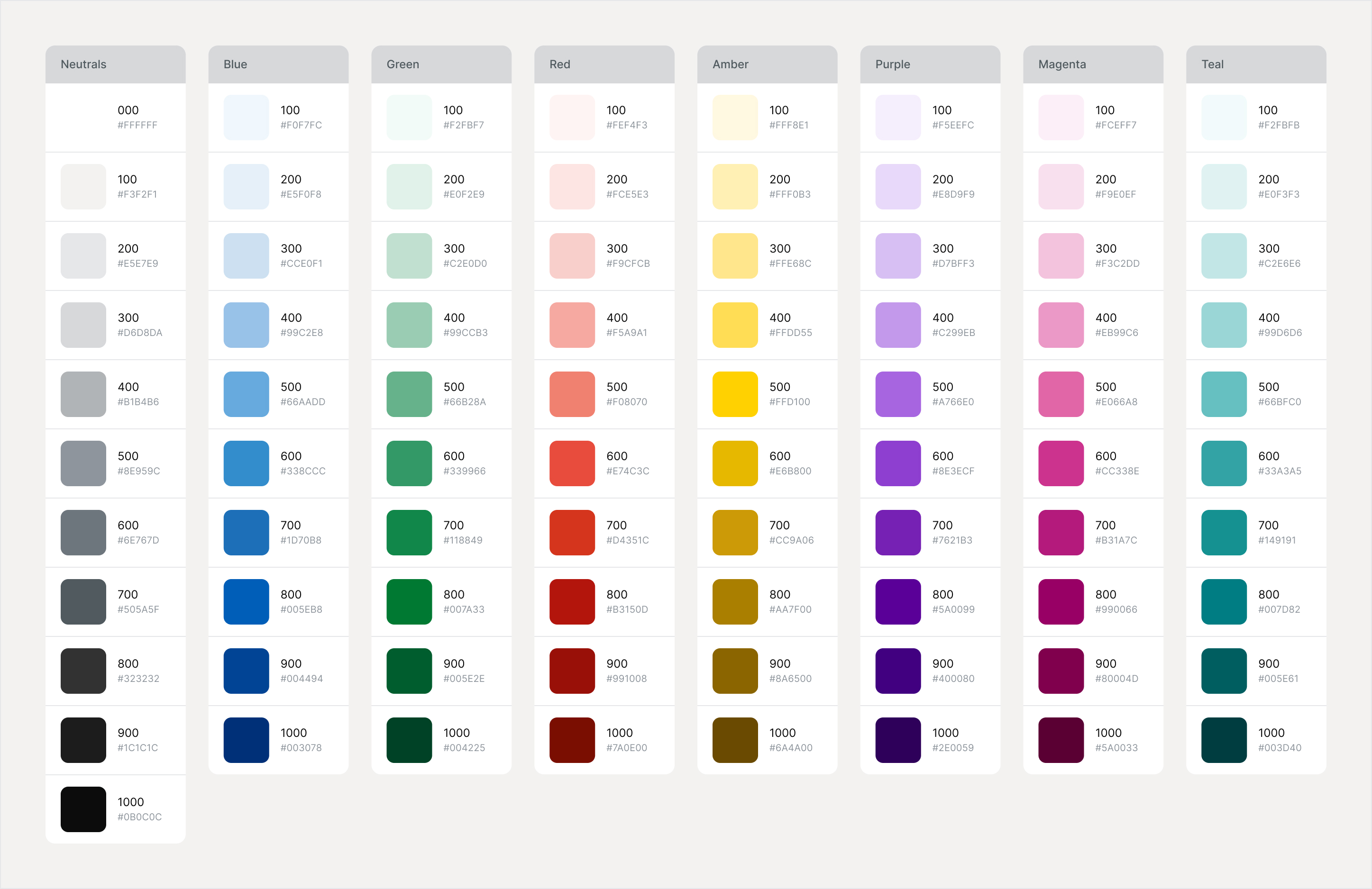
Established core foundations across colour and dimensions. Colour was carefully refined to meet accessibility standards (contrast, hierarchy, state clarity), while dimensions followed an 8-point grid to ensure consistency across layouts and components.
📝 Typography
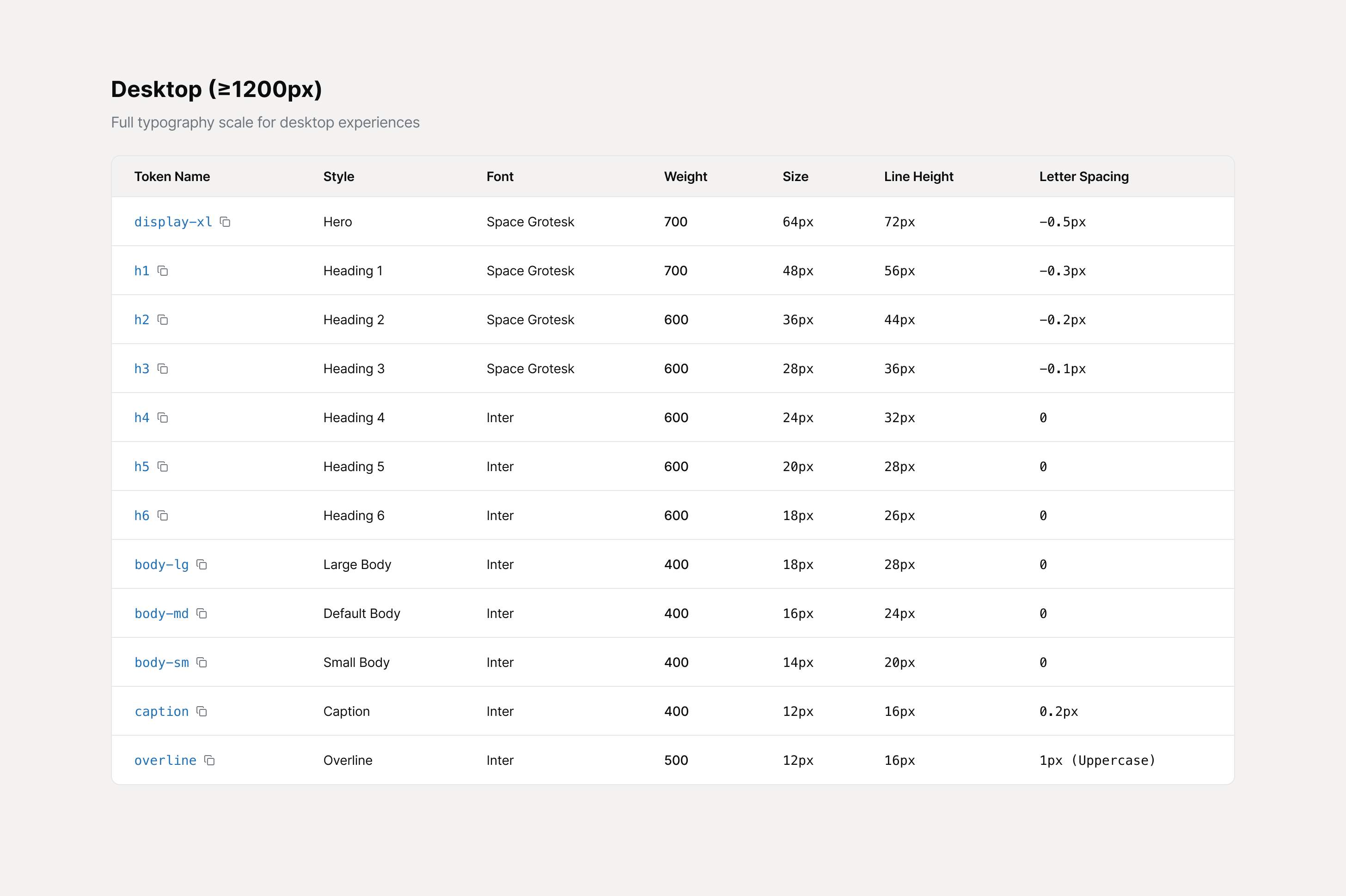
Defined a clear, legible type system starting from a 16px base. Scales and breakpoints were aligned to responsive design principles, supporting readability across devices while maintaining visual rhythm.
♟️Icons
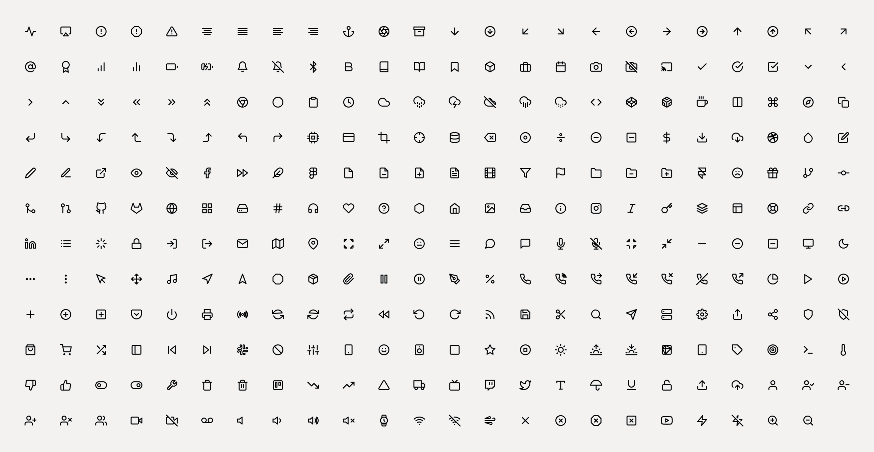
Leveraged a consistent icon set aligned to the grid system, ensuring flexibility across styles (filled, outlined) and themes (light/dark), while maintaining visual coherence.
👨💼🧑💼 Components
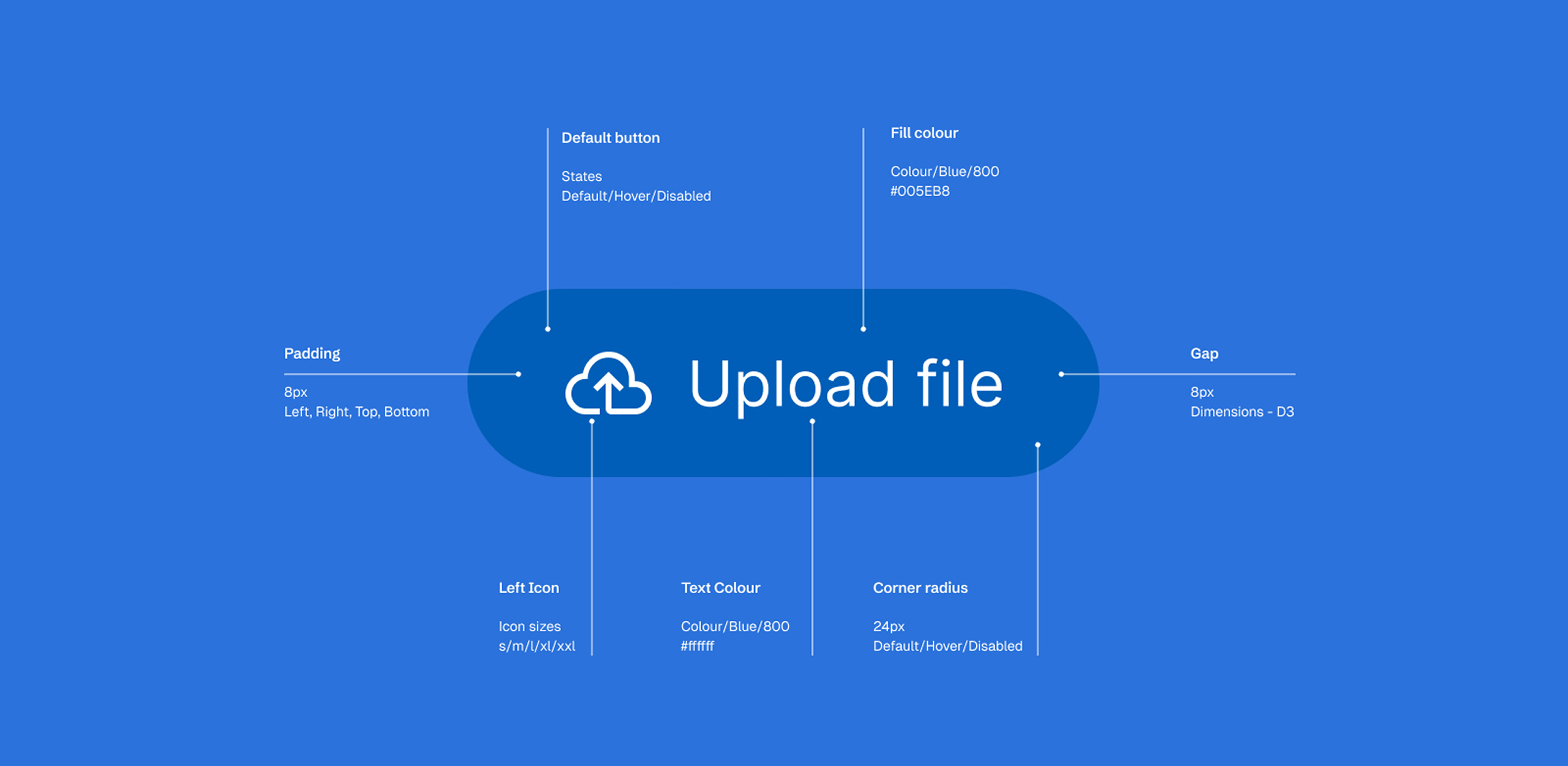
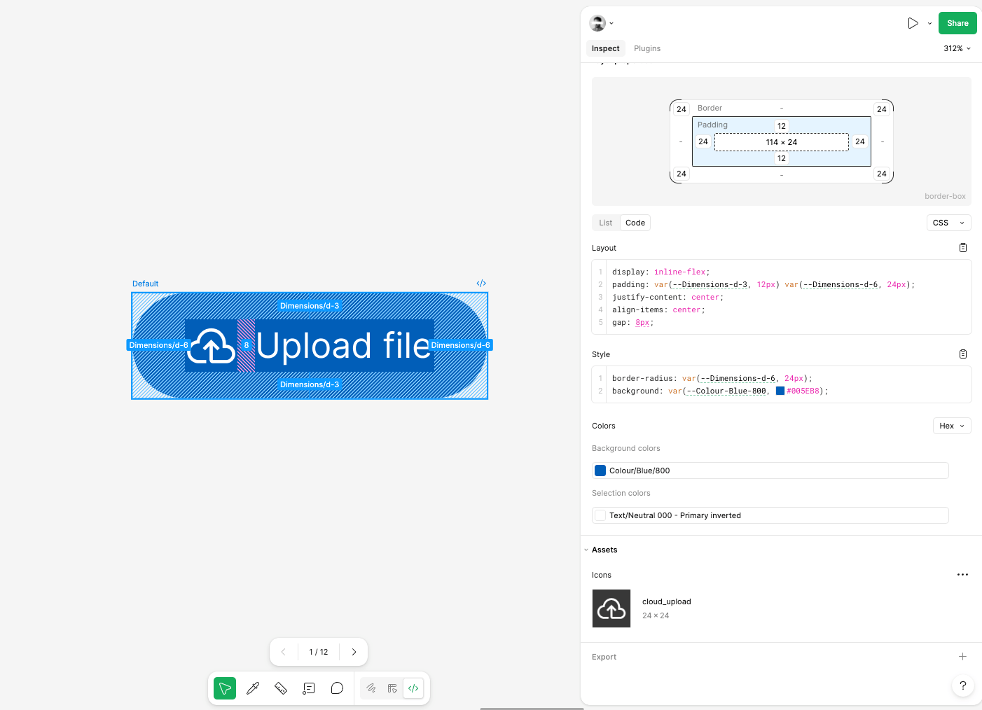
Developed reusable, scalable components—starting with buttons to establish tone and interaction patterns—then expanding into a broader system designed for efficiency and consistency.
👨💼 Naming & Structure
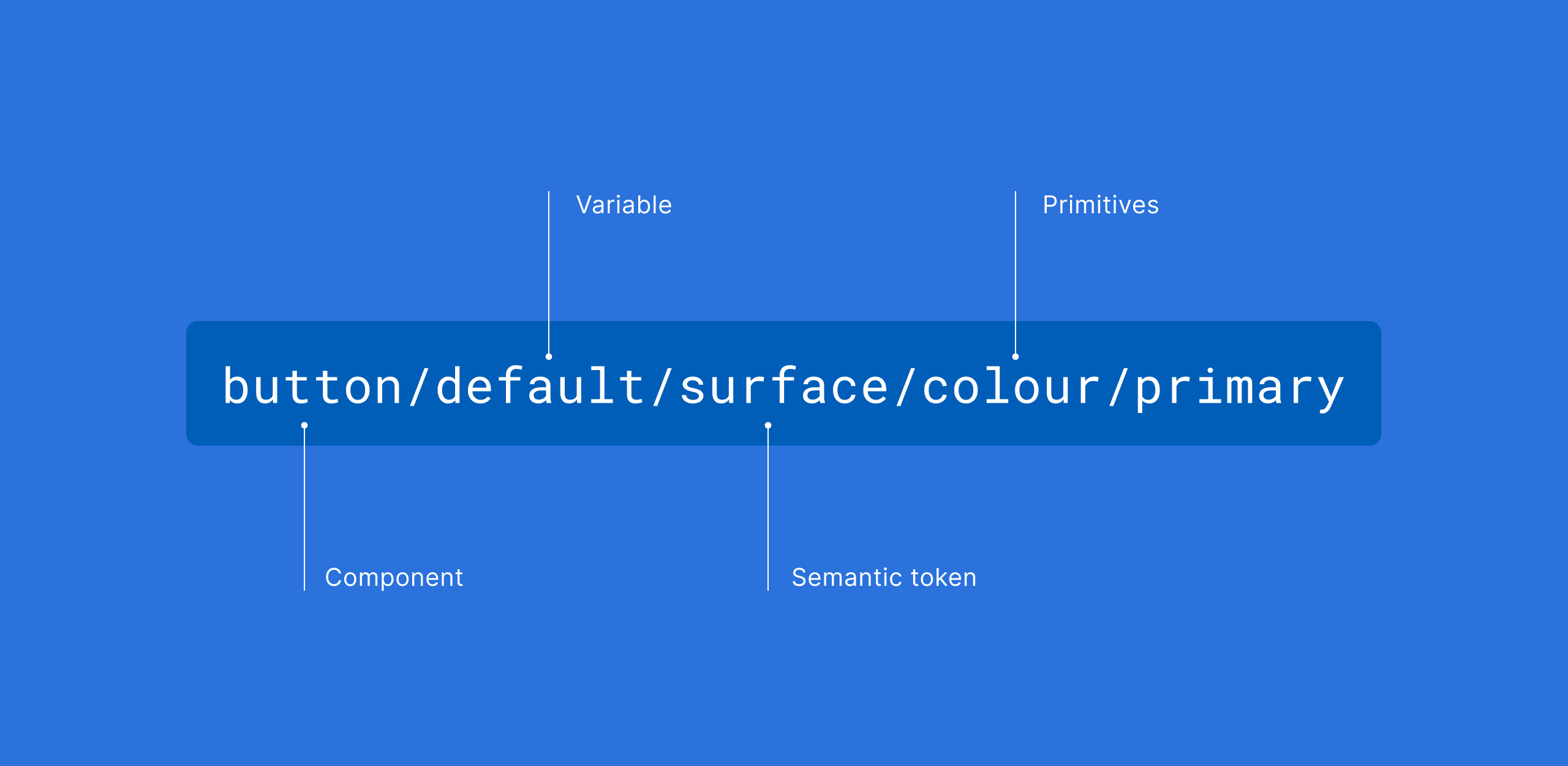
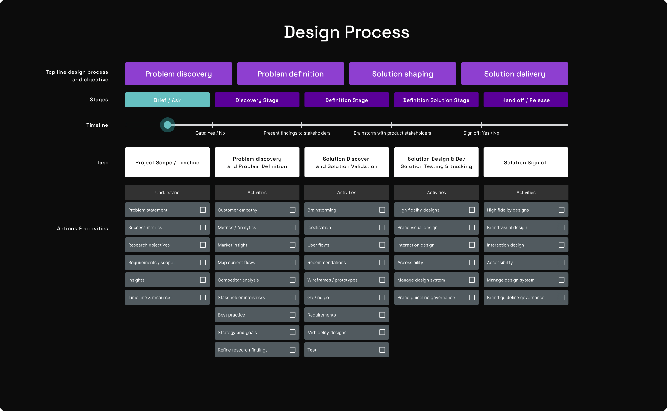
Created a flexible naming convention that balanced clarity with scalability, enabling easier collaboration between designers and developers. (See example above) Custom component made below
Outcomes & Learnings
Design within constraintsSystems thrive on clarity and consistency. Accessibility, grid systems, and semantic colour usage shaped more effective design decisions.
Tooling accelerates qualityPlugins and AI-assisted workflows significantly improved speed, consistency, and collaboration.Progress over perfectionThere’s no single “correct” system—alignment across teams matters more than rigid rules. Iteration and communication are key to long-term success.